Editor’s note: This is a guest post by Marlon Hernandez
For the past year, across four different classes and countless bars, I have worked on an idea that is quickly becoming my go-to project for any Master of Information Science assignment; the Archivist Beer Vault (ABV) database. At first it was easy to explain the contents: BEER! After incorporating more than one entity the explanation grew a bit murky:
ME: So remember my beer database? Well now it includes information on the brewery, style AND contains fictional store transactions
WIFE: Good for you honey.
ME: Yeah unfortunately that means I need to add a few transitive prop… I lost your attention after beer, didn’t I?
Which is a fair reaction since trying to describe the intricacies of abstract ideas such as entity relationship diagrams require clear-cut visuals. However, drawing these diagrams usually requires either expensive programs like Microsoft Visio (student rate $269) or underwhelming experiences of freeware. Enter Lucidchart, an easy to use and relatively inexpensive diagram solution.
The website starts off users with a few templates to modify from 16 categories, such as Flowchart and Entity Relationship (ERD), or you can opt for a blank canvas. I prefer selecting the Blank (Name of Diagram) option as it clears the field of any unneeded shapes and preselects useful shapes.
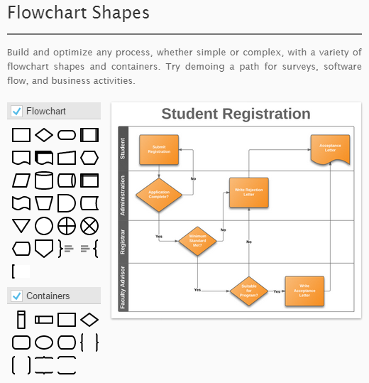
While these shapes should be more than enough for standard diagrams, you are also free to mix and match shapes, such as using flowchart shapes for your wireframe diagram. This is especially helpful when creating high fidelity wireframes that require end product level of detail.
Once you have selected your template it is easy to begin your drawing by dragging the desired shapes onto the canvas. Manipulating shapes and adding text overlays is straightforward, you merely click the edge of the boxes of the shape you want and adjust the size of it, which can either be done manually or set to a specific pixel size. Using the program is akin to having access to Photoshop’s powerful image manipulation tools but in a streamlined user-friendly UI. Most users can get by with just the basic options but for advanced users there are settings to adjust your page size and orientation, add layers, revision history, theme colors, adjust image size, and advanced text options. The frequently updated UI adds user requested features and contains tutorials within the diagram menu.
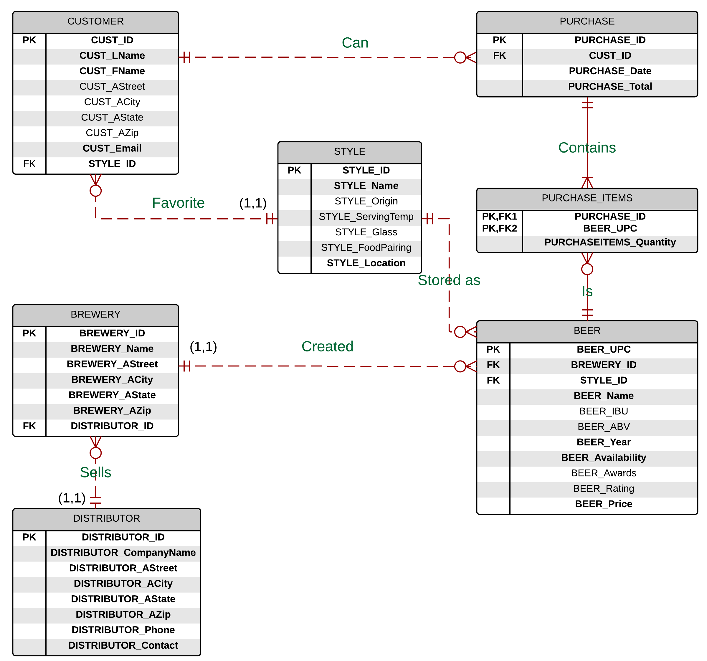
It also contains intuitive features such as converting lines that connect entities into cardinality notations with pulldown options to switch to the desired notation style. This feature is not only practical but can also help with development. Getting back to the ABV, as I drew the entity structures and their cardinalities I realized I needed to add a few more transitive entities and normalize some of the relationships as I had a highly undesirable many-to-many relationship between my purchase table and items. As you can see below, the ABV’s ERD makes the complex relationships much more accessible to new users.
It was easy to move tables around as LucidChart kept the connections on a nice grid pattern, which I could also easily override if need be. This powerful flexibility lead to a clean deliverable for my term project. The positive experience I had creating this ERD lead me to try out the program for a more complex task, creating wireframes for a website redesign project in my Information Architecture class.
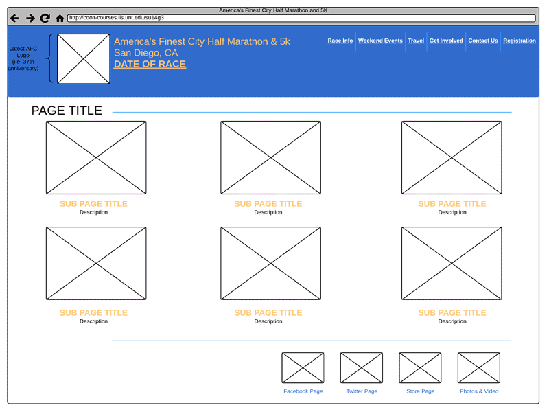
Tasked with redesigning a website that uses dated menu and page structures, our project required the creation of low, medium, and high fidelity wireframes. These wireframes present a vision for the website redesign with each type adding another layer of detail. In low fidelity wireframes, image placeholders are used and the only visible text are high level menu items while dummy text fills the rest. Thankfully LucidChart’s wireframe shapes contained the exact shapes we needed. Text options are limited but it did contain one of the fonts from our CSS font family property. Once we reached the high fidelity phase it was easy to import our custom images and seamlessly add them to our diagram.
Once again LucidChart provided a high quality deliverable that impressed my peers and professor. With these wireframes I was able to design the finished product. With LucidChart’s focus on IT/engineering, product management & design, and business, you can find a vast amount of shapes and templates for most of your diagram needs such as Android mockups, flowcharts, Venn diagrams and even circuit diagrams. There are a few more perks about LucidChart and a few lows.
PERKS
- Free… sort of: For single users there are three levels of pricing; Free, Basic $3.33/month (paid annually), and Pro $8.33/month (paid annually). Each level adds just a bit more functionality than the last. The free account will get you up and running with basic shapes but limited to 60 per document. Not too bad if are you creating simple ERDs. Require more than 60 objects or an active line to their support? Consider upgrading to Basic. Need to create wireframes? Well you’ll need a Pro account for that. Thankfully, they are actively seeking to convert Visio users by offering promotional pricing for certain users. For instance, university students and faculty can follow the instructions on this page to request a free upgrade to a Pro account. Other promotions include 50% off for nonprofits and free upgrades for teachers. Check out this page to see if you qualify for a free or discounted Pro account. I can only speak for the Education account that adds not only the Pro features but also the Google Apps integration normally found under Team accounts.
- Easy collaboration… for a price: As seen in the figure below, users can reply, resolve or reassign comments on any aspect of the diagram.
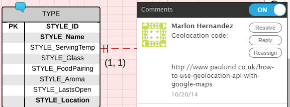
Comments example All account levels include these basic functions. However, a revision history that tracks edits made by collaborators requires a Pro account. Moreover, sharing custom templates and shapes are functions reserved for Team account users, which starts at $21/month for 5 users.
One final note: each collaborator is tied to their own account limitations which means free account users may only use 60 shapes even if they are working on a diagram created by a Pro account. - Chrome app: The Chrome app converts the website into a nice desktop application that is available offline. Once you are back online the application instantly syncs to their cloud servers. The app is fully featured and responds quicker than working on the website. Using the app is a much more immersive experience than the website.
LOWS
- Pricing for non-students: As you can see by now LucidChart has an aggressive pricing plan. The Free account is enough for most users to decide if they want to create diagrams that involve more than 60 shapes. It is a bit disappointing to see that the Basic account only adds unlimited shapes and email support. Furthermore, wireframes and mockups are locked up behind the Pro level. Most of these Pro features should really fall under Basic. Still, the $99 annual price for a LucidChart Pro account is far less than Visio, which starts at $299 for non-students.
- Chrome app stability: For the most part the website has been a flawless experience, the same cannot be said for their Chrome app. There have been times where the application crashes to desktop, the constant syncing did save all of my work, or some shapes becoming unresponsive. There is also an ongoing bug that keeps showing me deleted documents, which do not appear on the website.
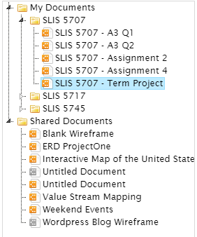
Icons in grey were deleted months ago but still show up in the Chrome App None of these knocks against the app have prevented me from using it but it is worth mentioning that the app is a work in progress and can feel like a lower priority for the company.
Don’t just take my word for it, you can try out a demo on their website that contains most of the Pro features. Are there any projects you can see yourself using LucidChart? Have a Visio alternative to share? I’d love to hear about any experiences other users have had.
Marlon Hernandez is an Information Science Technician at the Jet Propulsion Laboratory Library where he helps run the single-service desk, updates websites and deals with the temperamental 3D printer. He is currently in the final year of the MS-IS program at the University of North Texas. You can find him posting running reviews, library projects and beer pictures on his website: mr-hernandez.com.