In May, I was one of the 50+ fortunate participants in Collections as Data: Hack-to-Learn, a two-day workshop organized by Library of Congress, George Washington University, and George Mason University.
Four datasets and five tools to work with the data were provided in advance. On the first day, we met at the Library of Congress and were introduced to all the datasets, as well as three of the tools.
The first of the datasets was the Phyllis Diller Gag File. The Smithsonian’s National Museum of American History and Smithsonian Transcription Center have been conducting a crowdsourcing project to transcribe the 52,000 original index cards of the comedian’s jokes; in March of this year the transcriptions were made available. Each card contains a joke, often a date, sometimes an attribution – if someone gave Diller the joke – and are organized by subjects that appear at the top of the cards. Some prep work had been done on the data, and we got comma separated files (.csv) and folders of individual text files to work with.
On May 16th, the day before the workshop, the Library of Congress released 25 million MARC records for free bulk download, making this, the second of the datasets, available for workshop participants, along with the rest of the world. The MARC files had been converted to .csv using MarcEdit, placing the MARC fields into separate columns.
Our third pile o’ data was the Eleanor Roosevelt’s “My Day” columns consisting of 8,000 transcribed documents representing Eleanor Roosevelt’s nationally-syndicated newspaper column, provided by George Washington University, where there’s a longstanding historical editing project of which “My Day” is only a small part. The columns have been encoded in TEI, one column per xml file. To prep the data for the workshop, both python and R were used to extract text. Participants got xml and txt files as well as the python extractor and a strip xml R script.
Possibly the most complicated dataset was the End of Term tumblr posts, consisting of text and metadata from 56,864 tumblr blogs posts from 72 federal tumblr blogs harvested as part of the End of Term Archive Project. This data was also made available in a variety of file formats, json, .csv, and plain text. The reason that this data was more complex, at least to my way of thinking, is because we only had the text and metadata – tags, from the tumblr posts – while much of the meaning in a tumblr post is visual. It was like getting only the caption, without the picture. The dates in the data were a mixed bag as well, because the federal agencies posting to tumblr included the National Archives, and Smithsonian museums, who often posted artifacts from their collections, resulting in a large number of 19th century – and earlier! – dates.
The five tools were OpenRefine, Voyant, MALLET, Gephi, and Carto. Day one was OpenRefine, MALLET, and Voyant, while day two was Gephi and Carto. Most attendees (including me) had some experience with OpenRefine, but the other tools were new to the majority of attendees. We were sent good instructions for downloading and installing software in advance of the workshop. Mac users had a bit of an advantage with java-based applications like Voyant and MALLET, since we could download a .jar file and run it locally.
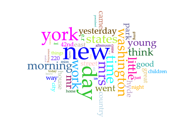
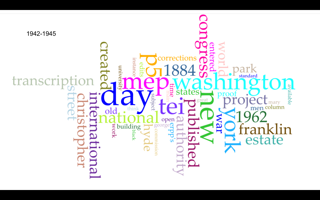
In the afternoons, we divided up into teams based on our interests in working with particular data, or tools, or both. On the first day, I worked with a team using Voyant to try to see patterns in Eleanor Roosevelt’s “My Day”. We thought we might be able to detect differences in the terminology Mrs. Roosevelt used pre-WWII, and during and after the war. We thought about looking at change from while FDR was living, and after his death, but FDR’s death date (April 12, 1945) coincides closely with the wind-down of the war in Europe, such as the end of the Battle of Berlin on May 2. We decided to use the .txt files, and divided them into chunks of a size that Voyant could ingest. We identified stop words to take out of our analysis; for example, every “My Day” entry closes with a copyright statement, Copyright [year] United Features Syndicate, Inc. We ended up with two graphs at the end of our work time:
On day two, we moved to George Washington University to work with network analysis tool Gephi, and Carto, a geographic analysis tool. Jen Stevens, Humanities Liaison Librarian at George Mason University, presented on Gephi, and I was initially pretty charmed with it. Stevens mentioned that at George Mason, they’re using Gephi to analyze ingredient use in the digitized version of the Fairfax Family Cookbook, that contains recipes popular in 17th and 18th century England. I thought maybe I could do a network analysis of which food bloggers link to which other food bloggers, and I still think that could be a good Gephi project, however, Gephi is pretty picky when it comes to prepping the data you want to analyze. In the afternoon, I worked with a team trying to use Gephi to analyze the tags from the end of term tumblr blogs, which kind of devolved into each of us scowling at OpenRefine, trying to come up with queries to extract the data in a usable form, pondering how to connect the tags to the posts, and generally trying to get the data into shape so that Gephi would paint a graph for us.
Overall, what I learned at the workshop consists of first, a bit of personal insight: I’m pretty good at tossing a small dataset into one of these tools, but still have not been successful at getting meaningful results from a larger body of data. For example, I was able to get Voyant to create a nice word cloud from a set of text files that all include a title, URL, and 200-250 word abstract, and I got Carto to map a spreadsheet of locations where I have students in internships this summer. These look nice but don’t tell us much. Second, regular expressions rule! Finally, and more universally important, you really have to have some kind of idea of what questions the data you have might be able to answer before you start using one of these tools. You may find yourself, in the words of Jeff Edmonds, “OpenRefining a lot of crap“. Almost ten years ago, Chris Anderson predicted that the data deluge meant the end of scientific theory. Rather than starting research by creating an hypothesis and looking for proof, Anderson said we’d be able to start by looking for patterns in the data itself. With all due respect to Anderson, after spending two long days looking at data and data analysis tools, I think forming the hypothesis is still a critical step in the research process, even in the age of massive data.